HopeBloom - Mental Wellness
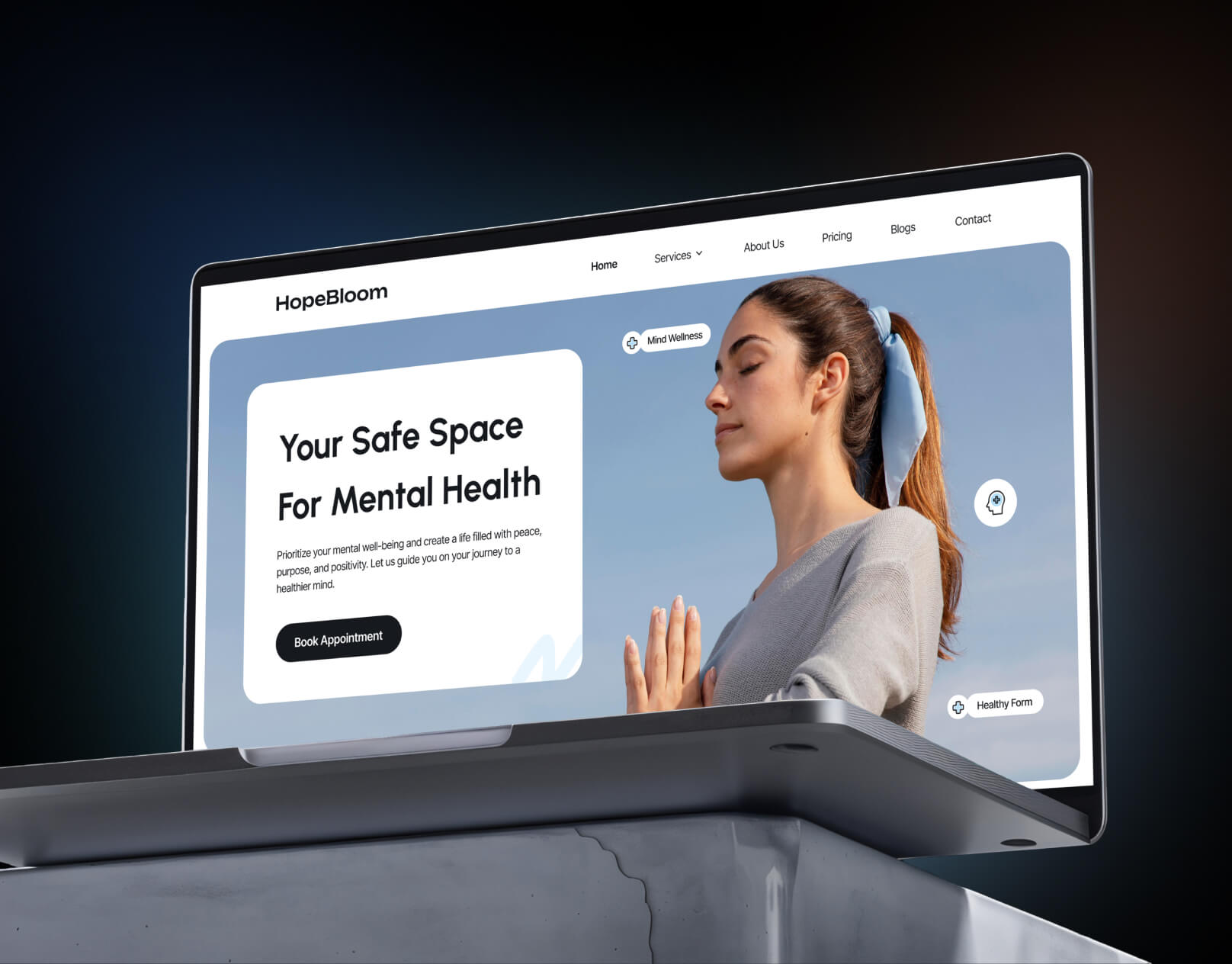
HopeBloom is a mental wellness platform focused on supporting emotional well-being, self-growth, and mindful living. The brand aims to create a safe, welcoming digital space where users feel understood, supported, and encouraged to prioritize their mental health. The website is designed to feel calm, human, and reassuring reflecting HopeBloom’s mission of healing and personal growth.
Branding
Design
About the Project
Project Goal:
Design a mental wellness website that builds trust, reduces anxiety, and encourages users to explore therapy, resources, and self-care tools in a comfortable and non-overwhelming way.
Scope of Work:
Website UX/UI design
Information architecture and user flow
Visual identity alignment for a wellness brand
Responsive design for desktop and mobile
Target Audience:
Individuals seeking mental health support
Users interested in mindfulness, therapy, and self-care
Young adults and working professionals looking for accessible wellness solutions


The Problem
Mental wellness platforms often face unique challenges:
Users may already feel anxious, overwhelmed, or emotionally vulnerable
Complex layouts, heavy content, or clinical designs can feel intimidating
Lack of emotional warmth can reduce trust and engagement
Difficult navigation can discourage users from seeking help
The Solution
Emotion-First Design: Created a calm, gentle interface that feels supportive rather than clinical
Simplified User Flow: Clear navigation helps users quickly find resources, therapy options, or support without cognitive overload
Trust-Building Layout: Used whitespace, friendly micro-copy, and approachable visuals to create emotional safety
Accessible Design: Ensured readability, contrast, and spacing to support users in all mental states
The design prioritizes emotional clarity, helping users feel at ease from the first interaction.

Visual Identity
Color Palette
Soft, muted tones inspired by nature and calm environments
Pastels and warm neutrals to evoke peace, hope, and balance
Avoided harsh contrasts to reduce visual stress
Typography
Rounded, human-centric typefaces for warmth and approachability
Clear hierarchy to make content easy to scan
Comfortable line spacing for stress-free reading
Imagery & UI Elements
Gentle illustrations and calming visuals rather than intense photography
Rounded cards and soft shadows to create a friendly, safe feel
Subtle animations to guide attention without distraction
Brand Voice
Empathetic, supportive, and non-judgmental
Encouraging rather than instructional
Focused on reassurance, growth, and positivity


The Results
Improved User Comfort: The calm interface helps users feel safe and supported while exploring mental wellness content
Higher Engagement: Clear layout and gentle visual cues encourage users to spend more time on the platform
Stronger Brand Identity: HopeBloom stands out as a warm, approachable mental wellness brand rather than a clinical service
Trust & Emotional Connection: The design fosters a sense of care, empathy, and emotional understanding